On better measuring gains in the standard of living
The main idea: the area under an assumed linear demand curve
is a far better approximation of utility gains than current GDP accounting
practices.
0. Posts on this blog are ranked in decreasing order of likeability to myself. This post was originally posted on 04.11.2021, and the current version may have been updated several times from its original form.
1 The Nominal
1.1 I was inspired to think of this when reading this post (h/t Astral Codex Ten). All of the relevant critique of the post itself can be found in the comments, but it helped me realize there is something off with real GDP as a measure of standard of life. I will take the opposite view of Less Wrong though, and state that real GDP accounting overestimates gains in standard of life.
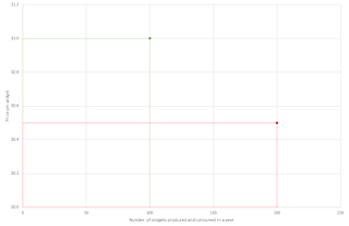
1.2 Let's take a simple economy that only produces and consumes widgets. I am not
interested in nominal – real distinctions here, so I need not assume any more
than one product class, and will stick to inflation not being a thing in this section.
1.3 In
2021, total production and consumption is of 100 widgets, sold for $1 each. In
2022, technology gains allow a massive increase of production to 200 widgets,
selling for $ 0.5 each. Nominal spending stays the same but, by the standards
of current GDP accounting as I understand them, real GDP seems to have doubled
in this example. Has it though?
1.4 Obviously
not, decreasing marginal utility is a thing, which is why you need to lower the
price to clear the greater quantity, which decreasing marginal utility is
completely ignored by GDP accounting. So, do I have a better answer?
1.5 Of
course, the utility given by the consumption of widgets can be approximated by the
area under the demand curve up to the equilibrium price/quantity combination.
1.6 OK, so
what is the shape of the demand curve? I’m sure econometricians will have come
up with tons of cool functions that approximate what they see in the market, but
we need none of that. We need the simplest model possible, which is just a straight
line that we can plot as we have two points (intercept of $1.5). Obviously, we assume demand itself hasn't shifted in between the two years.

1.7 So, in
our example we see our proxy for utility increasing from $ 125 in 2021 to $ 200
in 2022, so “just” a 60% increase instead of a 100% increase we would assume under
current assumptions.
1.8 What
about 2023, when the price and quantity equilibrium breaks from the linear relation
seen in 2021 and 2022? No issue, we draw a new linear demand curve using 2023 and 2022, with a (probably) new intercept. This method is an index method, not
a dollar value method, of course.
1.81 Sum over all goods and services, and voila (note how a good must be sold for two years straight to be included here).
1.9 Issues I can see are people annoyed at the linear assumption for demand curve shapes (obviously not a core assumption at all, but still one that allows calculation with just two years of data, since we need to assume no shifts in demand for the shortest time possible) and the standard’s susceptibility to inflation messing up prices. Still, current GDP accounting can hardly cast the first stone on the latter front.
2 The Real
2.1 This section
is much more speculative than the first, as I’m not at all sure the approach presented here would
be valuable to explore.
2.2 The
idea is to rely on the concept of price stickiness to make the calculations as
per section one trail real instead of nominal growth as much as possible: one
simply limits the period under review (i.e. the period in which quantities sold
are added up and prices averaged) down to the shortest period possible. Hopefully
one or two weeks, but surely not more than a month (little hope of counting on
price stickiness over a period longer than that). Shorter periods will make the assumption of no changes in the demand schedule more tenable.
2.3 In the semi-ideal example where the calcs are run every fortnight, you would get the proxy shape of the demand curve before any adjustments have had time to materialize due to fluctuations in the circulating volume of money. Running this every fortnight would approximate real growth to a greater extend – I think – than deducing inflation as calculated from an index. Surely a much better approximation than calculating real GDP based on production volumes, the issues with which are just what this approach seeks to address!
2.31 The issue with fortnightly calcs though is that certain goods are traded infrequently and if you limit your window you may miss any transaction at all! No solution here, I just hope in practice this isn't a huge issue.
2.4 Such
short calculation windows then miss out on seasonal effects, so that’s also a minus
here.
2.5 Now, what would one get if we were to compare the results of this calculation conducted on an annual basis (during which time prices can be assumed to adjust to a degree) with the chain-linked results from fortnightly calcs? An approximation, perhaps, of price inflation? Would this be competitive against index-type calculations?
2.6 A whole year as a basis of calculations would make the assumption of unchanged demand schedule hard to argue for. But do changes in the volume of circulation cause changes in the demand schedule, such as you need to assume a degree of change of the former if you're out to estimate the effects of the latter?


Comments
Post a Comment